|  Design & creative

In the design process, choosing a colour is more than just picking ones you like or choosing a couple that go together; it’s a careful choice driven by a core principle of integrity.

Colour should do more than just look appealing - it should carry meaning. Although aesthetic appeal can occasionally be the sole reason for colour selection in design-related work, it is rarely sufficient on its own. Whilst some might ratify colour selection and colour decisions with the swipe of a hand and no further justification other than “I just like it”, I want to examine how the integrity behind colour selection can add deeper value, impact and power to the effectiveness of a brand or marketing campaign, and how it can influence consumers who interact with it.

The reasoning behind colour choice

As a designer, I aim to draw meaningful connections and relationships to justify my design decisions, which includes the references and context behind colour choices.

I can point directly to a creative concept I worked on recently as an example: A brief to develop a brand for a new, sustainability driven range of housing for one of our house builder clients. The name of the proposed housing range was ‘Envision Homes’, which formed a key part of my design thinking.

I developed a base brand identity using a lead colour of a teal green - to suggest sustainability - and a palette of accent colours based on the common colours of human irises. The idea was that vision (from Envision) relates to eyes, and by anchoring it with a sophisticated deep teal green, I could build an identity with that all-important integrity.

System 1 and System 2 thinking

While colour choice can help us achieve design integrity, it can also go deeper than that and trigger emotional responses through associative meaning. After all, emotional response is the aim of the game for advertisers and marketeers - it’s the sign of an impactful visual.

Daniel Kahneman's book, 'Thinking Fast and Slow', leaning against a pile of other books

In order for this to be as effective as possible, we need a deeper understanding of the cognition behind consumer decision-making. In his book, Thinking Fast and Slow, Daniel Kahneman proposes the idea of 'System 1 and System 2 thinking’. System 1 thinking is instinctive and relies on ingrained cognitive biases. System 2 thinking, by contrast, is a rational approach - one by which we carefully analyse information before making a decision. Successful advertising and marketing plays on System 1 thinking in consumers, and colour selection can play a big role in this, ultimately affecting the effectiveness of a brand or a marketing campaign.

The psychology of colour

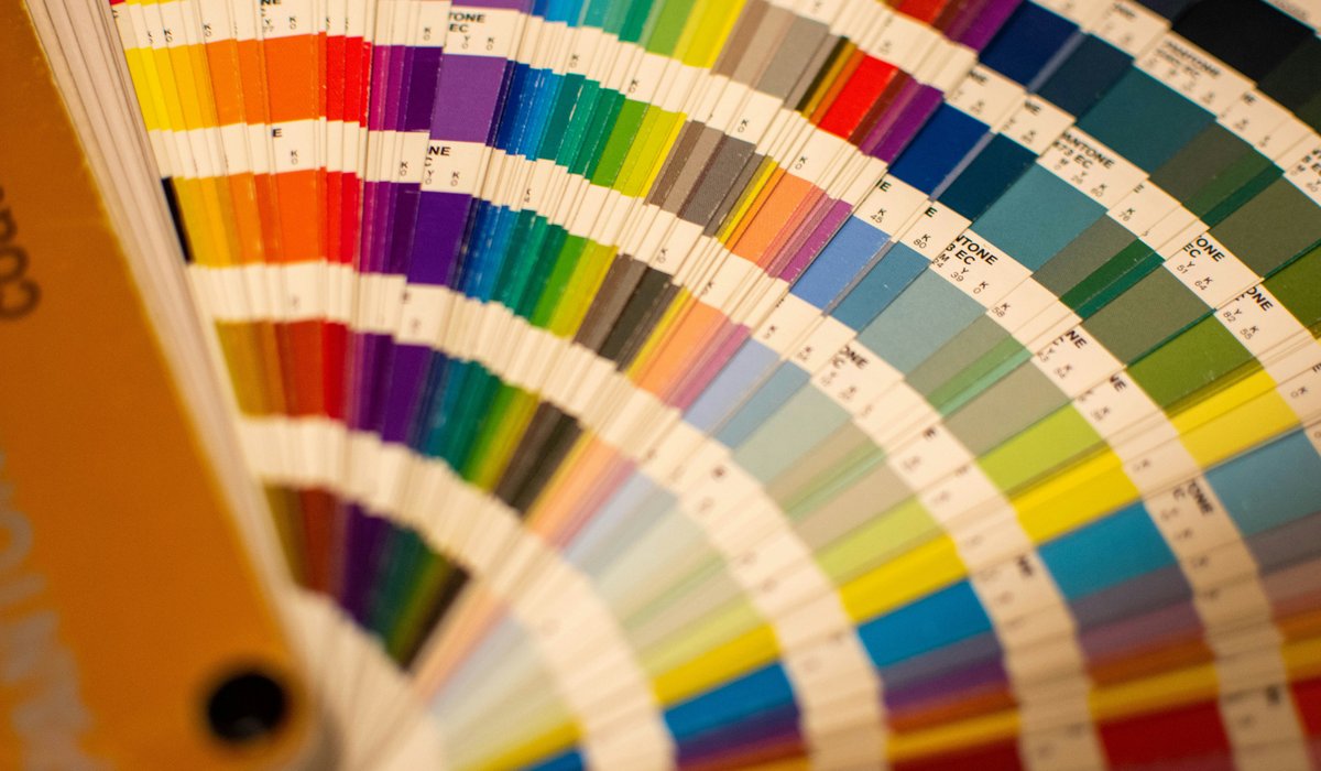
Colour psychology is deep-rooted in the makeup of the human brain; certain colours ignite certain emotions and feelings within us. For example, let’s take the colour red, which is an invigorating colour that’s often associated with intensity. It’s the colour of anger, fire, passion and danger, whilst at the same time being able to be the colour of love and warmth. It is an incredibly domineering colour with regard to human instinct and cognition, and many studies have been conducted into how the colour red affects people.

One notable study conducted by Russell A. Hill and Robert A. Barton in 2005 entitled, “Red enhances human performance in contests” concluded that in combat sports at the 2004 Olympics, the competitor wearing red was more likely to win against their opponent, who always wore blue. The study was extended into other sports revealing similar findings, providing evidence to suggest that red is one of the most emotionally influential and dominant colours.

Information like this is gold dust to designers, advertisers, strategists and marketeers. In this instance, it shows them how they can use colour red as a tool to ignite System 1 thinking and influence consumer responsiveness and, ultimately, their buying decisions. It’s no coincidence that two of the biggest brands in the world, McDonald’s and Coca-Cola, utilise a bright red as their core brand colour. These floods of red shroud the subconscious of consumers - there’s the power of System 1 in action again - guiding them to the Golden Arches or to a cold can of Coke without a second thought.

McDonald’s and Coca-Cola utilise a range of methods to encourage System 1 thinking in consumers, with the colour red being a cog in their overall marketing mechanisms. So with that in mind, before there is even any time for System 2 thinking to kick in, the consumers in question are likely already digesting a Big Mac meal and a Coke as McDonald’s and Coca-Cola see yet more success with their marketing goals.

Summing up

It’s safe to say that the power of colour choice as a design decision can have a significant effect on both the meaning, effectiveness, and impact of a brand or marketing campaign. Whether we like it or not, System 1 thinking is consistently active in our daily interactions as the deep-rooted cogs in our brains operate and influence us in our subconscious, and colour choice can play a significant role in that. A designer’s colour selection isn’t just aesthetic - it is psychological leverage. Remember, whether you realise it or not, you are a target market.

Design that drives customer actions

Your creative needs to do more than just look good. Get in touch with us for design that makes things happen.

Let's talk
Pawel Adamek.png

Pawel Adamek

Designer / Animator