
Cambridge & Counties Bank is a Leicester-based bank specialising in savings, property finance and asset finance.
Service:
The Challenge
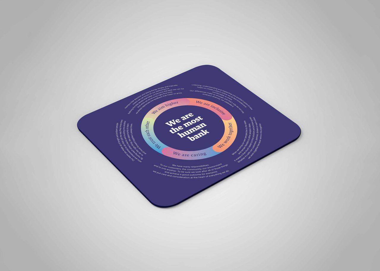
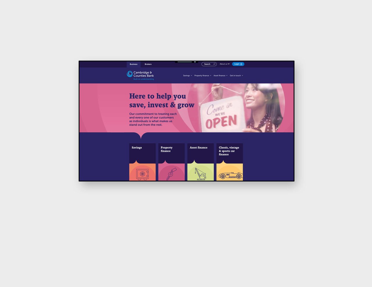
Cambridge & Counties Bank had a basic brand created for them in 2012 that felt ‘off-the-shelf’, which needed refreshing to reflect their growth and personality in the years since. Their mantra is that they’re ‘the most human bank’, but their brand appeared cold, bland, corporate and gave them limited stand-out, so we were tasked with creating a new one. The logo, core blue colour, and the corporate font needed to stay but everything else could be reimagined.
The Solution
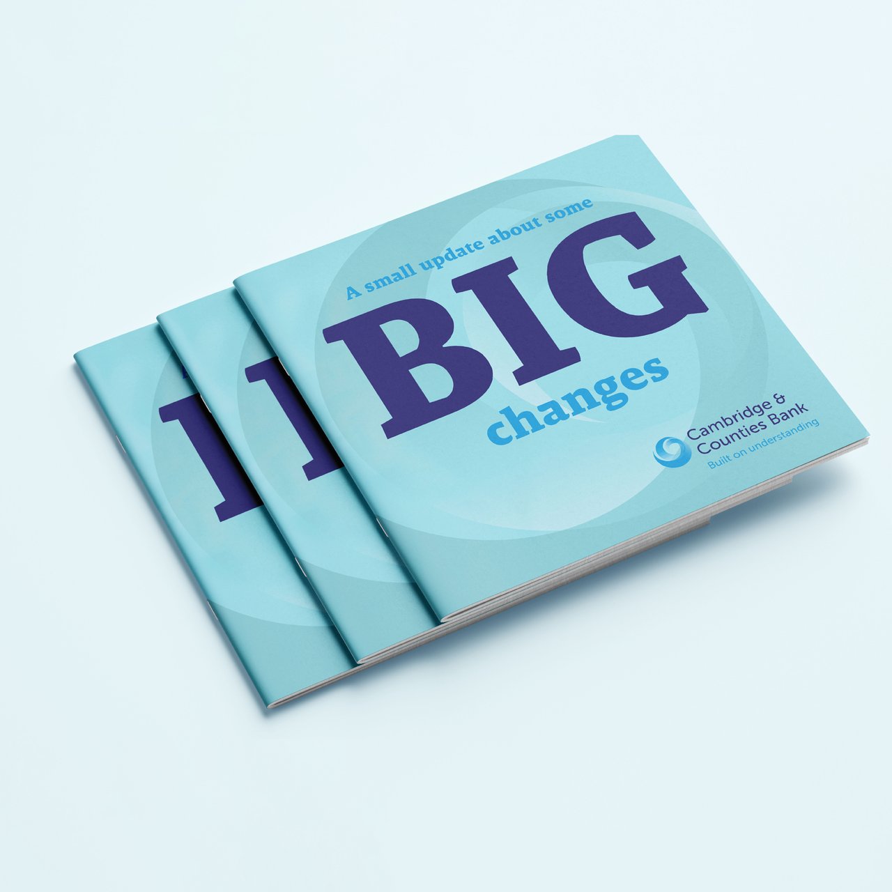
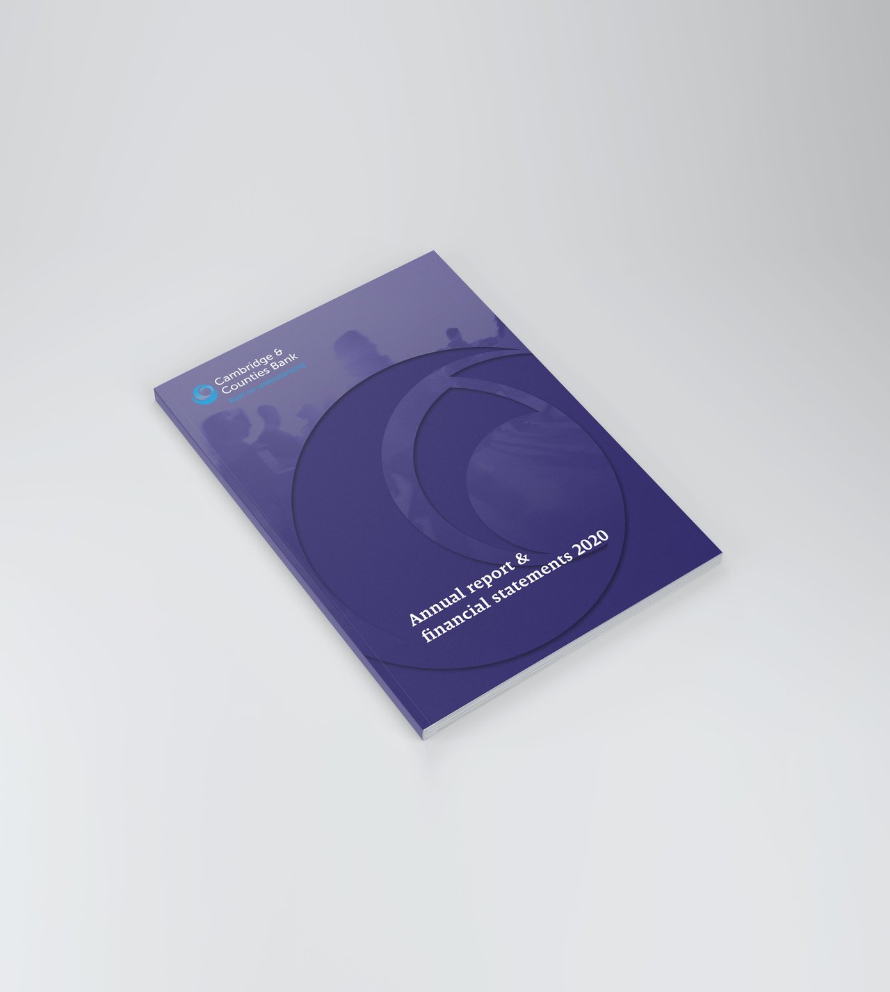
We introduced a ‘headline’ font with bags of personality that paired nicely with their existing sans serif font. We added a new navy colour to sit alongside their corporate blue, and a range of brighter secondary colours which could interchange with the primary brand colours.
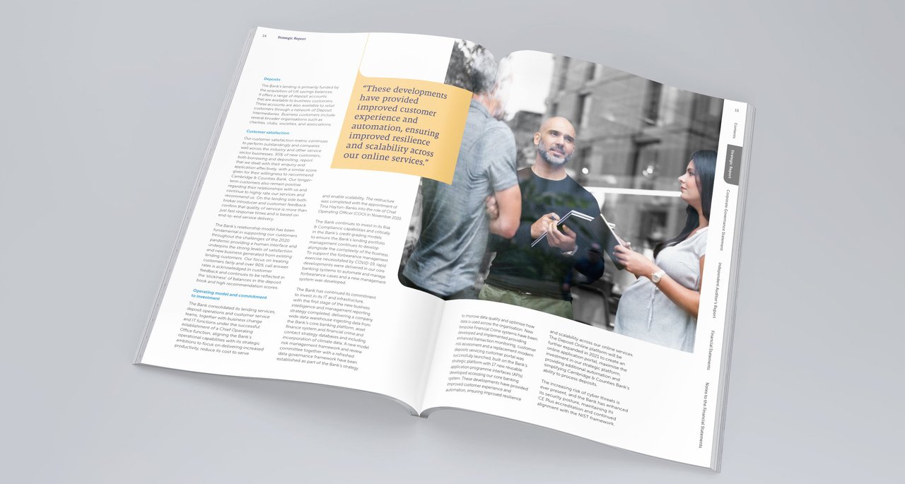
We developed a brand photo style that put the ‘human’ front and centre - the person in each shot is shown in full colour whereas the background is black and white or a mono-tone of the secondary colours.
To show their human side, the bank needed to talk like a human. We developed a new tone of voice with a closer, more personable feel, which helps to foster stronger connections with their customers and brokers.


The Outcome
The new brand perfectly reflects the essence of the bank. As well as their website and email marketing, the branding has been used across exhibition stands, print collateral, welcome packs, CCB’s interior office walls and various print campaigns. Our partnership with them is an ever-evolving one, and we’re continually working with them to develop their brand.
You can learn more about our design and creative work here.
The Team

Paul Petherick
Director

Dominic Palmer
Creative Director