Why visual consistency matters
Why visual consistency matters
From your website to your social media, your brand needs to have a cohesive image if it's goin…
Read article

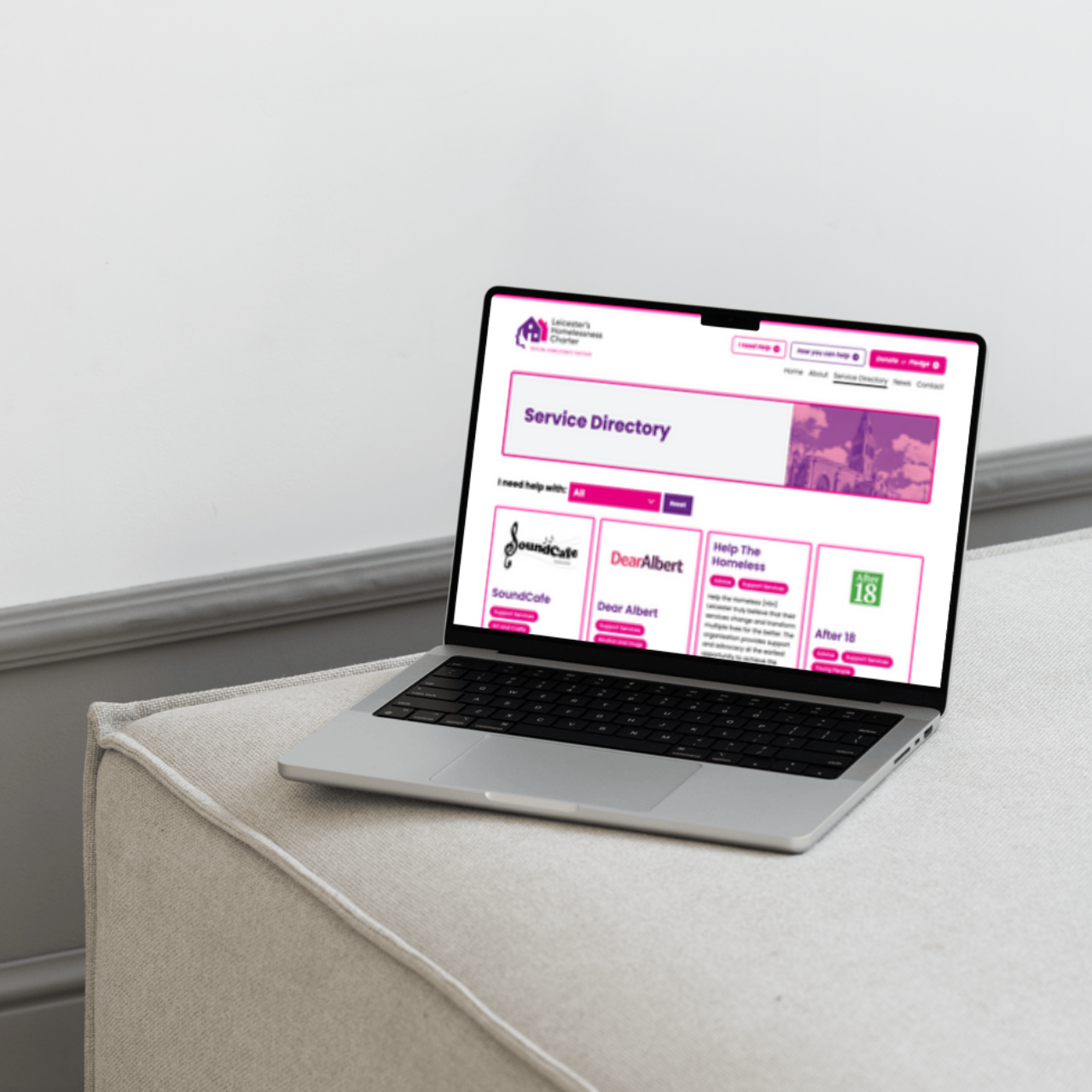
Accessible and inclusive design is crucial in ensuring everyone can access your content in the way that is most suitable for them. In this article, our Lead Technical Designer, Matt, talks through the details of accessible and inclusive design, and how you can incorporate it into your work.
Accessible design is centred around making digital or physical products, services, and environments usable and accessible to people with disabilities. Designing for accessibility may require you to meet specific technical standards, such the Web Content Accessibility Guidelines (WCAG) standards for accessibility.
Inclusive design is a broader way of thinking about the design process, designing for as many people as possible regardless of how they are able to access content. It’s a more nuanced and holistic approach which considers environmental, cultural, and other relevant factors. For example:
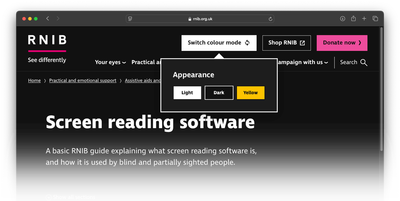
- Accessible design may include close captions on videos, designing for screenreaders, or a range of computer accessories designed for people with physical impairments.
- Inclusive design is a broader methodology, considering things such as good legibility, clear information hierarchy and colour contrast. In a more nuanced way, choice of photography may over- or under-represent a particular group of people and make someone feel marginalised, or dense technical language (jargon) may be difficult to understand.
In short, accessible design is essential for some, but good for everyone. Think of it this way: drop kerbs are essential for wheelchair users, but also good for people with pushchairs.
Designing with accessibility in mind from the start ensures your work reaches the widest possible audience. In Europe alone, there are around 30 million living with blindness or low vision and nearly 200 million with some degree of deafness. Good luck explaining to your client why you’re leaving that many potential customers behind.
Good accessibility reduces waste in clients’ budgets by ensuring as many people as possible see their message, and brands that recognise and cater for as wide a range of people as possible will always be perceived more positively. Another benefit of this approach is it forces us to look for more innovative design solutions, and this progressive attitude expands our skillset and moves the industry forward.
Finally, some accessibility measures may soon become legal requirements, so it’s worth getting a head start.
Making your work accessible to as many people as possible will involve catering for one or all of the main areas of disability:
There are many ways to cater for these specific needs, and taking an inclusive approach to your work will mean drawing on an even wider range of tools and practices. While many techniques and processes exist to make things easier for those with motor or cognitive needs, we work in a mainly visual medium and so tend to focus on the visual/auditory aspects.
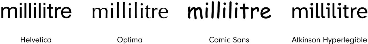
It’d be nice to assume that all typefaces are designed with legibility in mind – given that the literal job of typefaces is to be read – but this isn’t always the case. Things like ambiguous forms, short ascenders/descenders and mirrored letterforms can all hinder readability. Take a word like ‘millilitre’ for instance, with its high concentration of upright strokes, and see how well different sans-serif typefaces perform under this stress:
Atkinson Hyperlegible is a typeface designed by the Braille institute to address some of the key areas that affect legibility in some typefaces. It eliminates ambiguous forms, emphasises distinct pairs and clear uprights to maximise legibility, and there are a number of other fonts that have been designed along the same principles.
As well as your choice of typeface, you need to consider a range of other variables to make your work legible (and enjoyable!) to as many people as possible. Consider the point size, leading (linespacing), measure (number of characters on a line of text), and range of styles on a page – do you really need five different fonts in eight different sizes to get your message across?
Make sure all these elements are working together as effectively and efficiently as possible.
A simple, well-designed layout will assist anyone in reading your content. Consider things like heading and subheading structure, lists (where appropriate), and obvious navigation elements (e.g. page numbers, section headers, table of contents) to ensure people can quickly and easily find what they need, and avoid overly complicated layouts that get in the way of this.
These design elements are essential for some users, and will generally make the experience better for everyone.
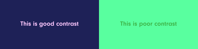
Colour blindness (or colour vision deficiency) affects around 3 million people in the UK, so ensuring good colour contrast is a must. Poor colour contrast will make things difficult for most and impossible for others, but it’s relatively easy to get it right. Tools such as TPGI’s Colour Contrast Analyser will help you assess your colour choices for good contrast, as well as simulate the various forms of colour blindness/deficiency.
Designing for print means you need to be sure you’ve made the right design decisions before going to press. Working in the digital space (be it websites or apps) offers a lot more ways to give your end users more control, allowing them to adjust font sizes or offering different styles that tailor the content to suit their needs, or even read it out loud to them. There are plenty of ways to make your digital products accessible to everyone, and a good place to start is the Accessibility in Government blog.
Delivery
If you need people with a visual impairment to be able to access your printed content, you have some options. The best option is usually to create a web version of your document, as this’ll give them more control over how they consume it and it’s a lot more flexible (see above). However, your client may not have the time or budget to do this, and may not want the hassle of keeping two versions of the same document.
The next best thing is to create an accessible PDF that can be read by screenreaders (such as JAWS or NVDA), which means setting up your document to meet WCAG (Web Content Accessibility Guidelines) standards. There are a lot of very specific steps to be taken to meet these standards, but it’s definitely worth the effort.
This has been a top-line summary of the ways you can approach accessibility. Ultimately, the steps you need to take will depend on the requirements of your audience; it’d be almost impossible to design for every scenario, but understanding your users’ needs from the outset is key to success.
We build attractive, effective and intuitive designs that suit the exact needs of our clients and their audience. Talk to us today to discuss your next project.
Get in touch
From your website to your social media, your brand needs to have a cohesive image if it's goin…

We don’t believe brand values are just what you write on your website just to fill a space, or a re…

Anyone can boast about what their brand values are, but brands need to be putting those values into…